 "KirkyV" (KirkyV)
09/04/2015 at 05:37 • Filed to: None
 2
2
 5
5|
"KirkyV" (KirkyV)
09/04/2015 at 05:37 • Filed to: None | 2
| 5 |
This new layout is annoying the crap out of me. Look at how much less stuff you can fit on the screen—it’s absurd!
Before
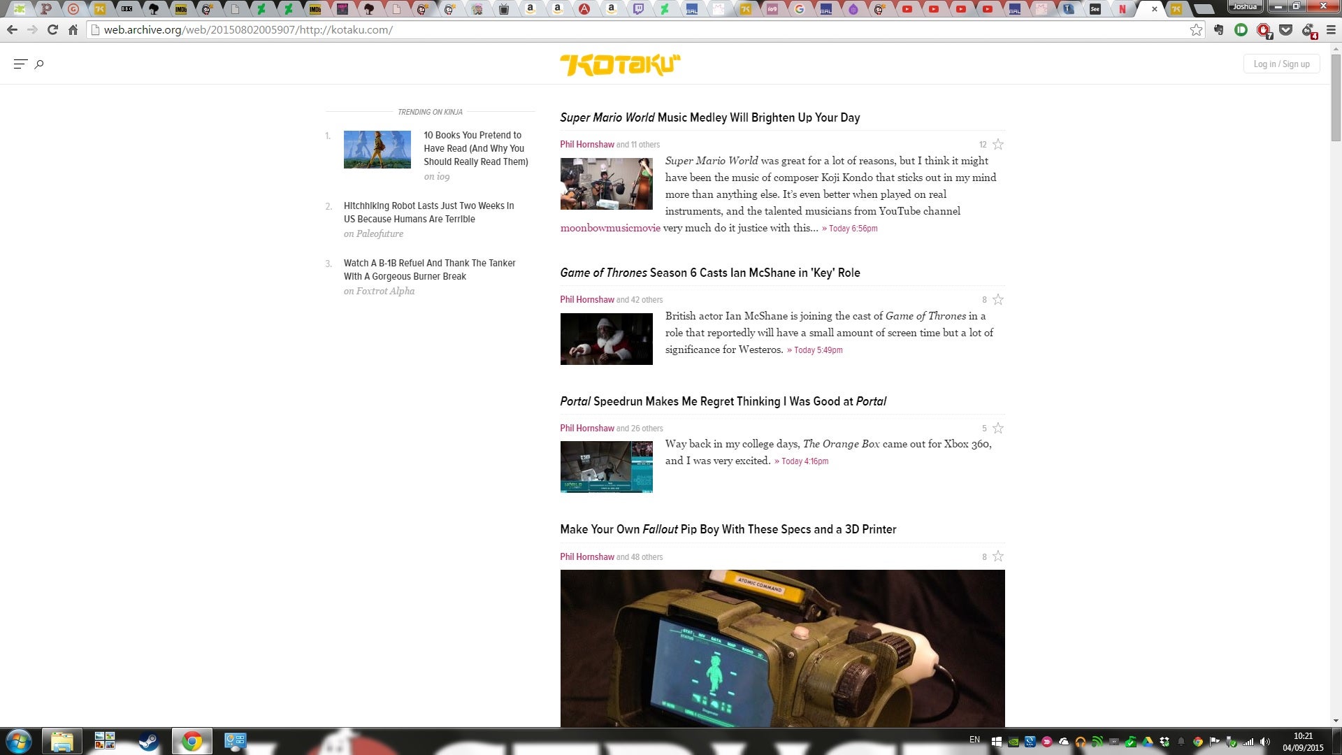
After:
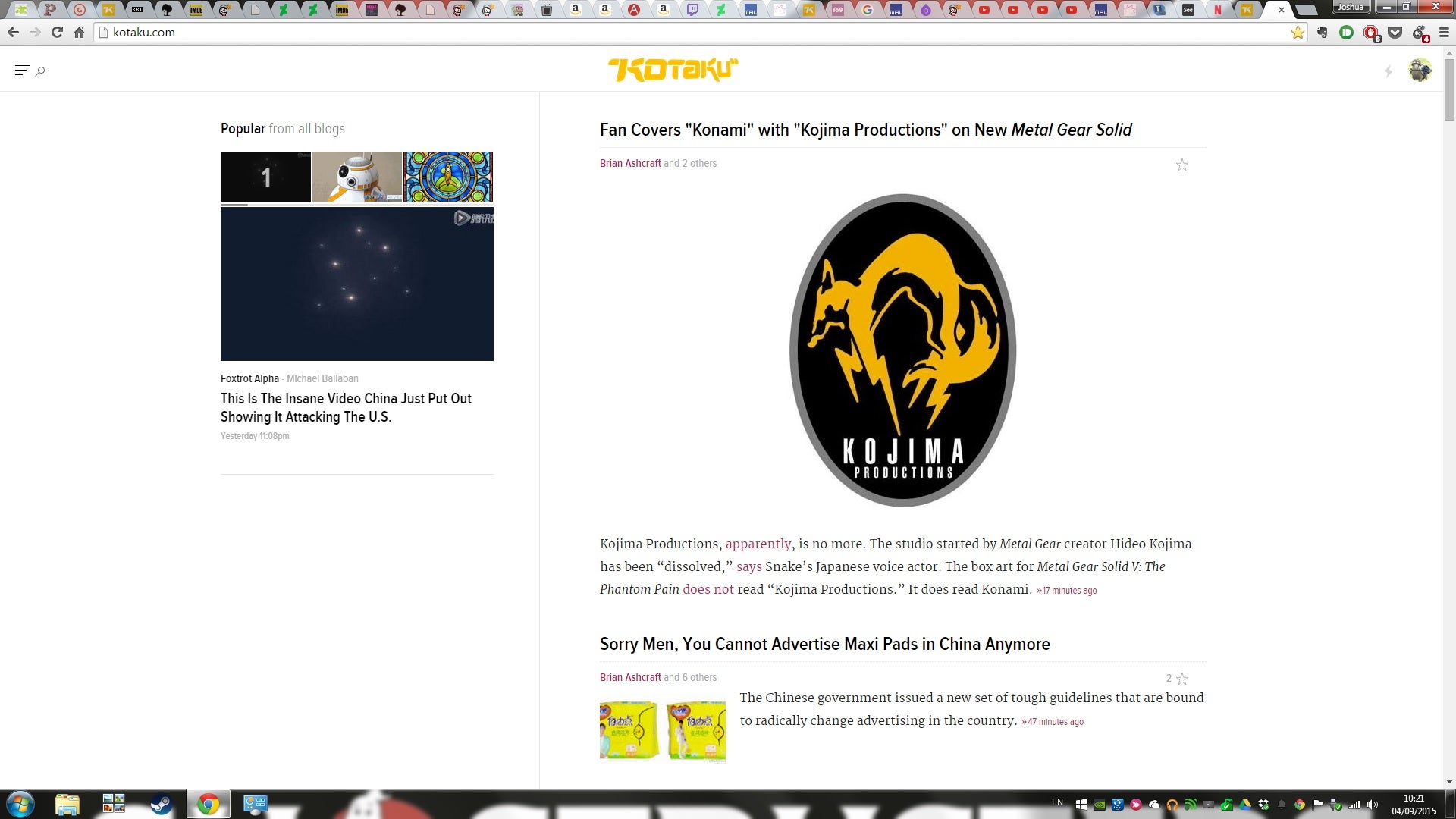
It doesn’t help that they seem to have almost completely given up on using the smaller post size. Seriously, if you scroll down !!!error: Indecipherable SUB-paragraph formatting!!! , it’s giant pictures as far as the eye can see. The site’s become all but unusable on my old 1280 x 800 MacBook.
 Amoore100
> KirkyV
Amoore100
> KirkyV
09/04/2015 at 06:08 |
|
Quick tip: If you set zoom to 67%, then everything is back to normal :) That’s just how I leave Kinja permanently now...
|
KirkyV
> Amoore100
09/04/2015 at 06:17 |
|
I do actually have it slightly zoomed out - I reset for the sake of the comparison - but I find that, at a level that adequately simulates the old look, the text gets too small. The Jalopnik home page isn’t nearly as bad as Kotaku seems to have gotten.
|
Amoore100
> KirkyV
09/04/2015 at 06:22 |
|
Yep, thus is the nature of progress...I couldn’t comment about the Kotaku vs Jalopnik differentiation but I must say I still found Jalopnik incredibly unusable without zooming out today...
 Matt Hardigree
> KirkyV
Matt Hardigree
> KirkyV
09/04/2015 at 08:03 |
|
So this is step one of a larger move and, I believe, in the upcoming version it’ll size appropriately to your screen.
|
KirkyV
> Matt Hardigree
09/04/2015 at 08:05 |
|
That would be a great relief; thanks for taking the time to respond.